

Revere Pewter is not merely a beige or a gray; it is a masterful greige. This balance is its primary strength, allowing it to bridge the gap between warm and cool color palettes, providing a sophisticated foundation for nearly any interior design scheme.
Understanding Revere Pewter's Complex Undertones
The genius of Revere Pewter lies in its complexity. It is a light gray with substantial warm, earthy undertones. In a perfectly balanced lighting situation, it presents as a soft, welcoming greige. However, its character shifts in response to its environment—a quality that makes it a "chameleon" color.
Depending on the light source and surrounding colors, Revere Pewter can reveal subtle hints of green or, less commonly, a touch of blue. This is not a flaw but a feature. It prevents the color from feeling flat or one-dimensional, giving walls a depth that simpler neutrals lack. Understanding this behavior is the key to successfully using it in your Central Indiana home.
Book Your Upcoming Paint Project
Craftsman Painter is now scheduling premium transformations. Secure your spot and elevate your property value.
Get an EstimateHow Revere Pewter Performs in Indianapolis Lighting
Central Indiana's lighting has a distinct character. We experience brilliant, direct sun in the summer months, but also contend with the soft, diffused, and often cool gray light of our long winters. A paint color must perform well in both scenarios.
In a north-facing room in Zionsville or a historic home with smaller windows downtown, the cooler ambient light will emphasize Revere Pewter's gray base, making it feel more like a true, grounded neutral. Conversely, in a south-facing room with large windows, such as those in many new Fishers homes, the warm sunlight will draw out its beige undertones, creating a cozy and inviting atmosphere. It adapts, preventing spaces from feeling too cold in the winter or overly warm in the summer.
Pairing Trim and Accent Colors with Revere Pewter
Revere Pewter's versatility extends to its compatibility with other colors. It provides a stable backdrop for a wide range of trim and accent choices.
For trim, a clean, bright white is almost always the correct choice to create sharp, defined lines. Benjamin Moore's Chantilly Lace (OC-65) offers a pristine, gallery-like contrast. For a slightly softer but equally timeless pairing, White Dove (OC-17) provides a gentle warmth that complements the beige undertones in Revere Pewter.
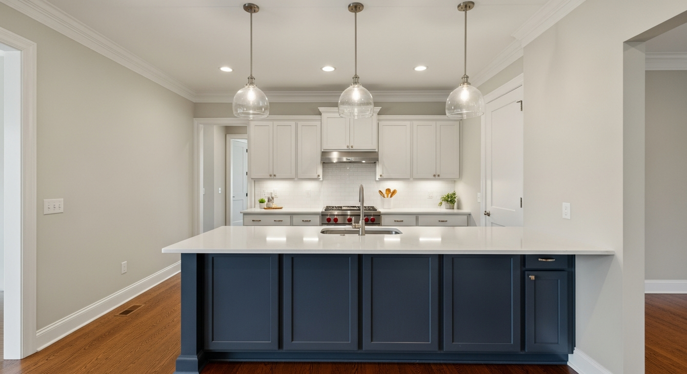
When considering accent walls or cabinetry, the color pairs beautifully with deep, saturated hues. A dark charcoal like Kendall Charcoal (HC-166) or a classic navy such as Hale Navy (HC-154) creates a dramatic and sophisticated palette that feels both modern and established.
Is Revere Pewter Right for Your Project?
Revere Pewter is an exceptional choice for unifying open-concept floor plans, creating serene bedrooms, and providing a refined backdrop in living and dining areas. Its ability to harmonize with both wood tones and stone finishes makes it a reliable selection for kitchens and bathrooms.
However, despite its reputation as a can't-miss neutral, the most critical step remains unchanged: sampling the color in your own space. Paint a large swatch on several walls and observe it throughout the day, from the bright morning light to the artificial lighting of the evening. This is the only way to see precisely how this chameleon color will behave in the unique context of your Indianapolis home. For a flawless finish and expert color guidance, professional consultation and application are paramount.