
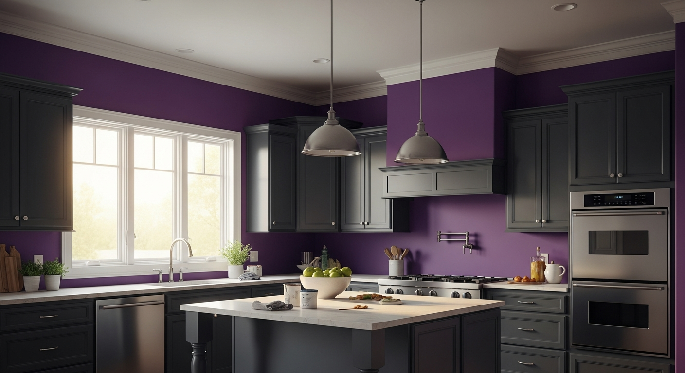

Enter Sherwin-Williams Verve Violet (SW 6979).
This is not a color for the timid. It is an unapologetic, high-voltage jolt of chromatic energy that fundamentally alters the spatial dynamics of a room. When deployed with absolute precision, this specific violet transforms the kitchen hearth from a mere utilitarian workspace into an intensely atmospheric theater of domestic life.
The Anatomy of the San Diego Sun
To understand Verve Violet is to understand how color behaves under extreme environmental shifts. San Diego coastal light is dynamic, operating in two distinct daily acts. The morning marine layer acts as a massive softbox, filtering out warm photons and flooding the home with cool, blue-heavy wavelengths. Under this diffused, melancholic morning light, Verve Violet pulls inward. Its blue undertones dominate, rendering the kitchen cabinets or prep island deep, bruised, and quietly sophisticated. The color absorbs the shadows, creating a dense, grounding presence around the heavy storage flanks of the prep zone.

Work Directly with Torlando Hakes
Skip the color choice stress. Work directly with me as your personal Color Designer to select the perfect architectural palette for your home, and get a Complementary Color Consultation when you purchase paint through us.
By noon, the atmosphere burns off, and the narrative violently shifts. The intense, direct Southern California UV rays strike the painted surfaces, and the color’s Light Reflectance Value (LRV) of 16 goes to work. While an LRV of 16 is mathematically dark, the sheer saturation of Verve Violet catches the golden hour light and ignites the red undertones buried in its formula. The prep hearth suddenly hums with kinetic warmth. The color stops absorbing light and begins radiating it, shifting the visual relationship from heavy and grounded to electric and expansive.
Architectural Mass in the Culinary Hearth
Paint is not merely a decorative afterthought; it is a structural element. It carries undeniable architectural mass. In the kitchen’s operational center, where the physical chaos of chopping, organizing, and cleaning occurs, visual hierarchy is critical.
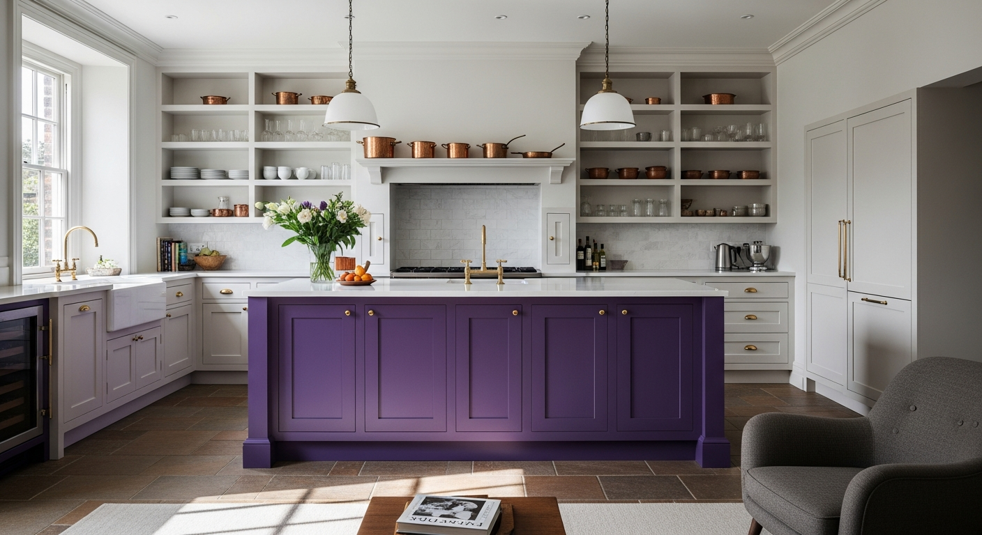
Wrapping the heavy lower millwork of a prep island in Verve Violet establishes immediate gravity. The violet visually drops the center of gravity in the room, creating a solid base upon which the rest of the kitchen’s materials can rest. The eye immediately registers the prep zone as the undisputed nucleus of the room. It separates the active, tactile space of the culinary hearth from the passive perimeter spaces. Against the sharp, linear geometry of modern cabinetry, this aggressive hue introduces an element of the organic and the unexpected. It prevents the kitchen from feeling like a sterile, clinical laboratory.
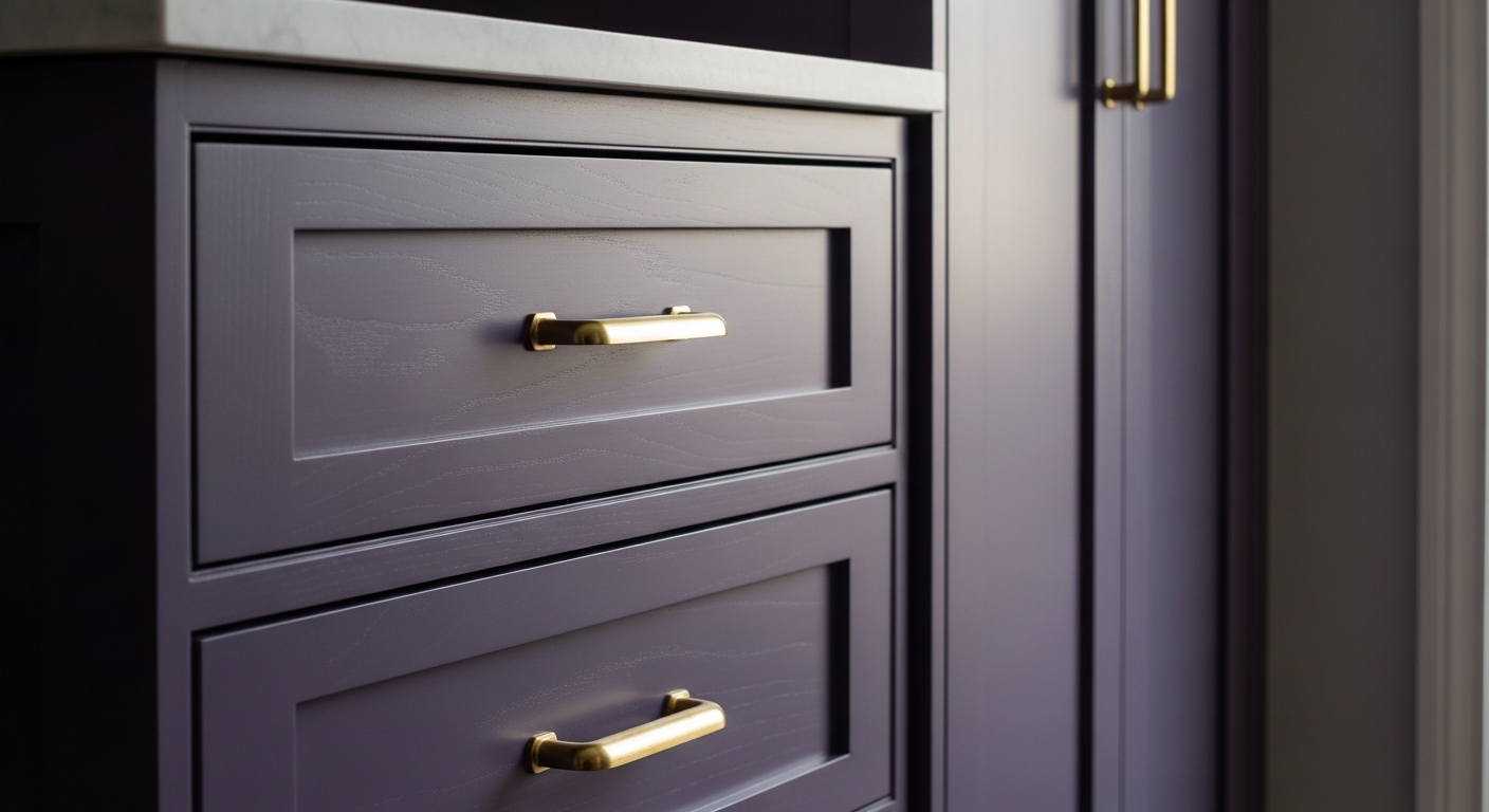
The Exact Chemistry of Complements
A color as dominant as Sherwin-Williams Verve Violet cannot survive in isolation. It requires a meticulously calibrated framework of coordinating colors to provide visual friction. Throwing this much saturation into a room demands stark boundaries to keep it from swallowing the architecture whole.
To frame Verve Violet, the surrounding upper planes and trim require an uncompromising, razor-sharp white. Sherwin-Williams High Reflective White (SW 7757) is the precise tool for the job. With a staggering LRV of 93 and virtually zero undertones, SW 7757 acts as a palate cleanser. It provides maximum contrast, turning the violet into a distinct, contained architectural feature rather than an overwhelming wash. The sharp white bounces the San Diego sunlight deep into the room, ensuring the kitchen remains functionally bright for culinary prep while allowing the violet island to exist in its own dense pocket of color.
For a secondary grounding element, introduce Sherwin-Williams Cast Iron (SW 6202). This deep, green-leaning charcoal acts as the perfect foil to the violet’s heat. Used sparingly on internal pantry doors or structural metal columns, Cast Iron provides a cool, heavy counterweight. Finally, punctuate the entire vignette with raw, unlacquered brass hardware. The yellow-gold of the living finish sits directly opposite violet on the color wheel, creating maximum complementary vibration.
The result is a kitchen operational center that refuses to be ignored. It is an environment built on tension, texture, and a profound respect for the transformative power of light.
 After
After Before
Visualize Your Space with Color Studio AI
Planning a project? Skip the paint chip guesswork. Use our Color Studio AI to instantly visualize these paint colors on your own walls, or take advantage of our aligned contractor pricing matching current Sherwin-Williams retail promotions.
Book Your Upcoming Paint Project
Craftsman Painter is now scheduling premium transformations. Secure your spot and elevate your property value.
Get an EstimateHelp Others Find Professional Color Insights
Share this story directly to your networks or copy the link to share with friends.