
Navigating this transition requires more than a casual coat of paint. It demands a rigorous understanding of color theory, light absorption, and visual weight. Drawing from structural design principles forged at the Eskenazi School of Art, Architecture + Design, color is never treated as mere decoration. It is an architectural boundary. When transitioning from the chaotic, sun-drenched streets of Atlanta to the interior of a home, the entryway palette must forcefully lower the visual temperature and command a shift in headspace.
The Liminal Space and the Power of Pewter Green
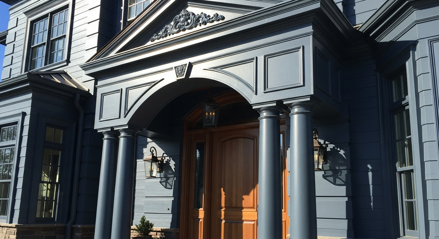
Forget the sterile, developer-grade whites that offer zero resistance to the harsh southern light. The architecture of arrival requires gravity. The definitive answer for the Atlanta threshold is Sherwin-Williams Pewter Green SW 6208.
This is not a timid hue. Sitting heavily on the spectrum with a Light Reflectance Value (LRV) of exactly 12, Pewter Green is a masterful, brooding slate-olive. Its hex coordinates (#5E6259) reveal a precise balance: a deep yellow-green base heavily muted with slate gray. In a transitional space, an LRV of 12 acts as a visual sponge. Instead of bouncing the aggressive Georgia glare deeper into the hallway, Pewter Green absorbs it, instantly grounding the peripheral vision and forcing the eye to focus inward, toward the softer light of the home's interior.
Book Your Upcoming Paint Project
Craftsman Painter is now scheduling premium transformations. Secure your spot and elevate your property value.
Get an Estimate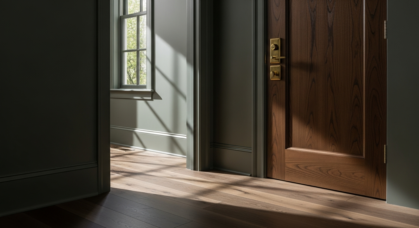
Interrogating the Southern Sun
A color's behavior is entirely at the mercy of its geographic environment. Atlanta’s unique lighting conditions—specifically the way the sun fights through the famous "City in a Forest" canopy—manipulate the undertones of Pewter Green throughout the day.
In the morning, under cooler, eastern-facing light, the color’s slate and silver undertones step forward. The walls take on a stoic, oxidized-metal quality that feels profoundly calming. But as the day burns on and the harsh western sun hits the threshold in the late afternoon, the light shifts heavily toward the warm, amber end of the spectrum. Here, Pewter Green performs brilliantly. Because it is rooted in a yellow-green hue family, it does not clash or turn muddy under golden hour light. Instead, the organic, mossy undertones ignite, echoing the lush foliage of Piedmont Park or the dense tree lines of Buckhead just beyond the glass.
Structural Complements and Trim Architecture
A single color cannot carry a space without the proper supporting cast. The interplay between the wall color and the architectural trim is where the visual tension is resolved. Pairing Pewter Green with stark, brilliant white is a severe misstep that destroys the moody, sophisticated envelope of the threshold.
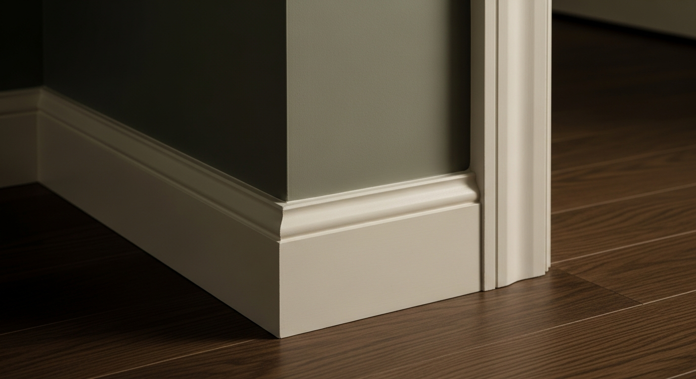
The trim, wainscoting, and ceiling require a deliberate, nuanced offset. Sherwin-Williams Alabaster SW 7008 is the mandatory companion. With an LRV of 82, Alabaster is highly reflective but possesses a subtle, warm beige undertone that prevents it from feeling clinical.
When Alabaster is applied to heavy baseboards or crown molding in a satin finish, it creates a sharp, tailored boundary against the matte expanse of Pewter Green. The visual relationship is symbiotic: the deep, absorbing nature of the walls makes the Alabaster trim appear crisper and more intentional, while the warm undertones of the trim prevent the dark walls from feeling cavernous.
The Psychology of the Palette
There is a distinct psychology at play when crossing a deeply saturated threshold. High-contrast, high-absorption entryways act as a sensory reset. The heavy saturation of Pewter Green compresses the space slightly, creating a cocooning effect. As one moves past the threshold and into the lighter, broader living areas of the home, the adjacent rooms feel instantly more expansive and airy by comparison.
This is the manipulation of visual volume through color. It is not an accident; it is the intentional orchestration of light and space. By anchoring the entryway in a profound, earthy dark like Pewter Green, the transition from the humid, sprawling exterior of Atlanta into the engineered comfort of the home becomes a deliberate, physical experience. The outside world is left at the door. The sanctuary begins.