
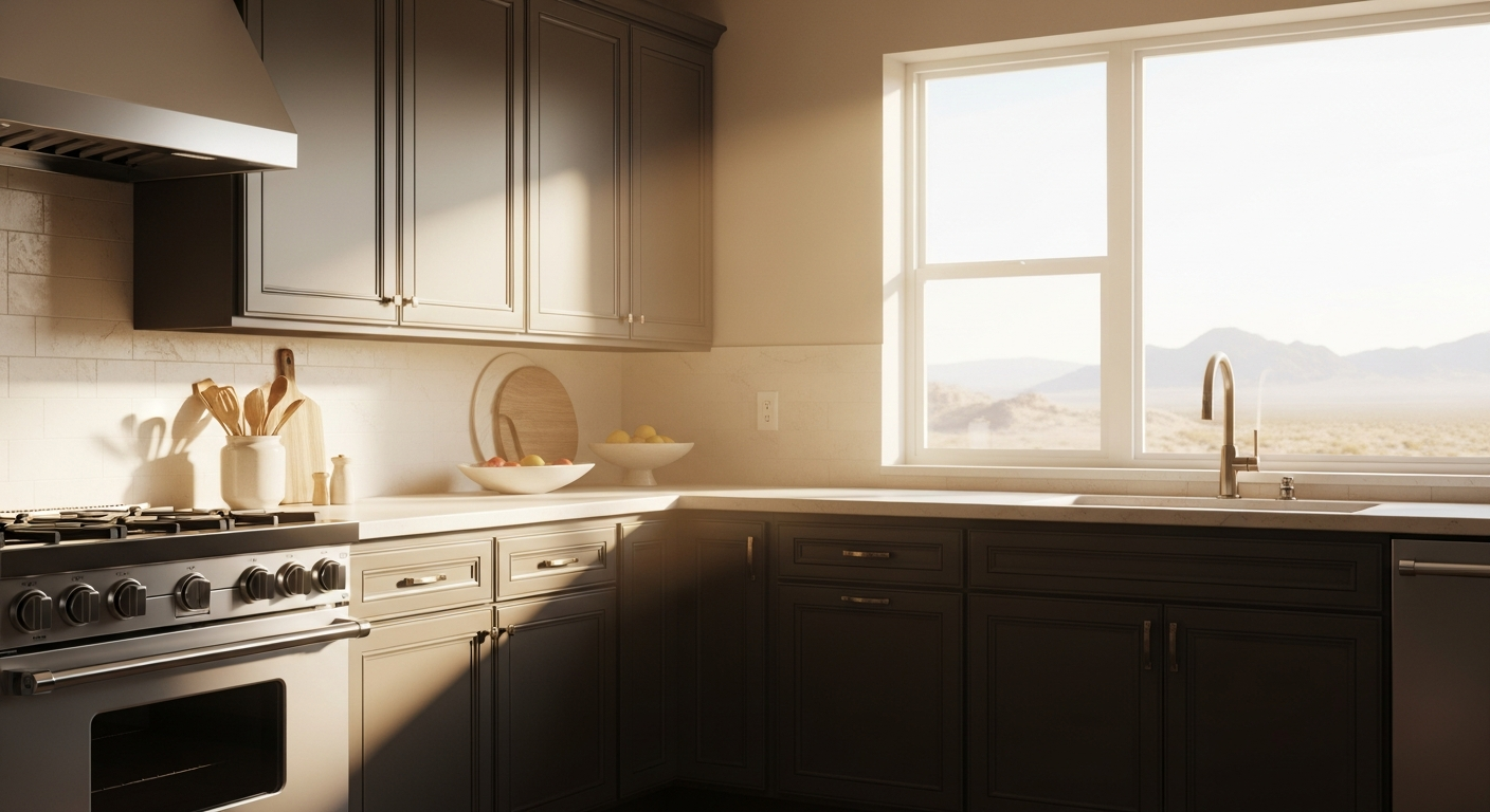

Wandering through the architectural revivals in Arcadia or the modernist builds carving into Camelback Mountain, a distinct shift is visible. The spaces that feel truly grounded, the ones that invite you to linger at the prep counter rather than squint against the glare, rely on a very specific, fiercely guarded neutral.
Enter Benjamin Moore’s Kingsport Gray (HC-86).
The Psychology of the Culinary Hearth
The kitchen’s functional core is a landscape of hard surfaces. Stone, metal, glass, and milled wood form an arena built for utility. When color is applied to this environment, it does more than decorate; it dictates the spatial volume. Bright, high-reflectance colors bounce light erratically, creating a frenetic visual frequency that is exhausting to the human eye over time.

Work Directly with Torlando Hakes
Skip the color choice stress. Work directly with me as your personal Color Designer to select the perfect architectural palette for your home, and get a Complementary Color Consultation when you purchase paint through us.
A high-functioning prep zone should visually recede, allowing the organic textures of food, stone, and hardware to command the foreground. A color with substance forces the cabinetry to act as an architectural anchor. It settles the room. When the eye meets a heavily saturated, earth-bound tone on a central island or a bank of base cabinets, the brain immediately registers a sense of permanence and calm.
Decoding Benjamin Moore Kingsport Gray (HC-86)
Kingsport Gray is not a trendy, fleeting greige, nor is it a cold, industrial concrete. It is a masterclass in restrained, muddy complexity. Boasting a Light Reflectance Value (LRV) of roughly 25, it sits firmly in the mid-to-dark range. It absorbs light beautifully without plunging a room into cavernous darkness.
What makes HC-86 an absolute powerhouse in residential design is its undertone behavior. Straight out of the historic collection, it carries a heavy dose of taupe, laced with a subtle bronze-green foundation. In a sterile, windowless box, it reads as a handsome, straightforward mushroom-gray. But put it in the path of natural light, and the alchemy begins.
Sonoran Light and the Alchemy of Undertones
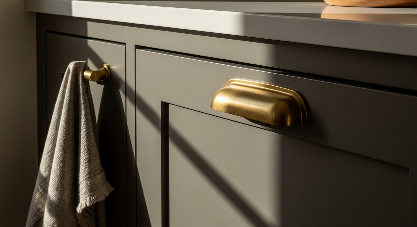
Light is never truly neutral, and in Phoenix, it is aggressively warm. The morning sun pulls out the bronze notes hidden deep within Kingsport Gray, warming the cabinetry to a rich, enveloping taupe. By high noon, when the Arizona sky acts as a massive, unforgiving spotlight, the color’s innate grayness steps up, holding its ground and refusing to wash out into a flimsy beige.
As the sun dips low and the light shifts to the legendary desert golden hour, Kingsport Gray undergoes its final daily transformation. The amber wavelengths of the setting sun collide with the green-bronze undertones, creating a profound, earthy depth that a standard-issue charcoal could never achieve. It is a color that works continuously with the environment rather than fighting it.
Executing the Palette with Absolute Precision
To deploy Kingsport Gray successfully in the kitchen’s operational center, the surrounding visual relationships must be curated with ruthless discipline. This color demands companions that respect its weight.
For the trims, ceilings, and upper architectural elements, stark titanium whites are strictly forbidden. They create a harsh, jarring contrast that shatters the room's harmony. Instead, Benjamin Moore’s Swiss Coffee (OC-45) or White Dove (OC-17) serve as the ultimate offsets. These creamy, softened whites carry just enough warmth to bridge the gap between the dark cabinetry and the ceiling plane, ensuring a smooth, continuous flow for the eye.
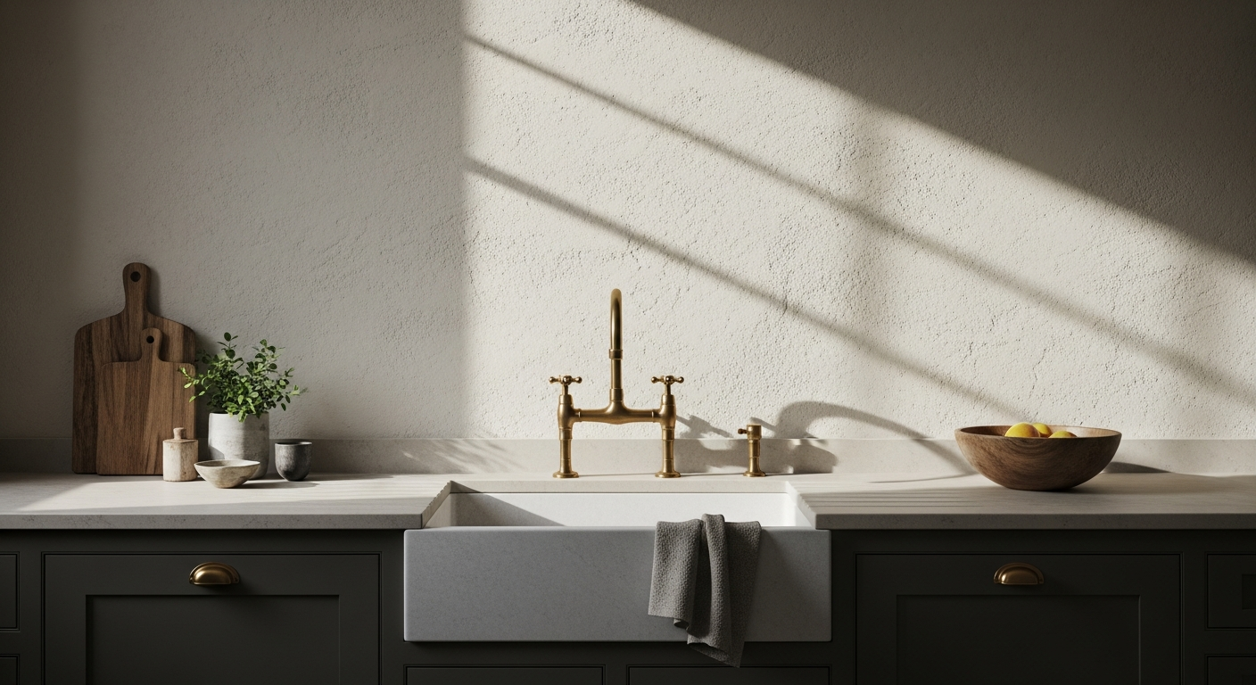
Hardware and fixture selections are equally critical. Kingsport Gray operates brilliantly against living finishes. Unlacquered brass, burnished bronze, or even heavily antiqued copper will pull the earthy undertones of the paint directly to the surface. Polished chrome or brushed nickel, conversely, will visually fight the taupe, leaving the space feeling disjointed and unresolved.
In the end, executing a flawless kitchen palette in the desert is an exercise in respecting the light. It is about abandoning the loud, the pristine, and the over-bright in favor of colors that possess genuine architectural integrity. Kingsport Gray offers exactly that—a profound, quiet strength that turns the hardest working room in the house into a space of absolute visual sanctuary.
 After
After Before
Visualize Your Space with Color Studio AI
Planning a project? Skip the paint chip guesswork. Use our Color Studio AI to instantly visualize these paint colors on your own walls, or take advantage of our aligned contractor pricing matching current Sherwin-Williams retail promotions.
Book Your Upcoming Paint Project
Craftsman Painter is now scheduling premium transformations. Secure your spot and elevate your property value.
Get an EstimateHelp Others Find Professional Color Insights
Share this story directly to your networks or copy the link to share with friends.