
In a region defined by brutal, gray winters and intensely humid, lush summers, the mudroom must visually absorb the shock of the climate. Weak, indecisive colors fail under the interrogation of the Midwestern sky. A utilitarian space demands profound visual gravity, a backdrop that anchors the architecture and defines the transition.
The Architecture of the Threshold
Enter Sherwin-Williams Iron Ore (SW 7069).
This is not merely a dark gray; it is a masterclass in spatial envelope design. With a Light Reflectance Value (LRV) of 6, Iron Ore acts as a chromatic sponge, soaking up the harsh, reflective glare of winter sleet and grounding the room in absolute sophistication. It carries an earthy, almost imperceptible green-brown undertone that prevents the space from feeling like a sterile, refrigerated void.
Book Your Upcoming Paint Project
Craftsman Painter is now scheduling premium transformations. Secure your spot and elevate your property value.
Get an Estimate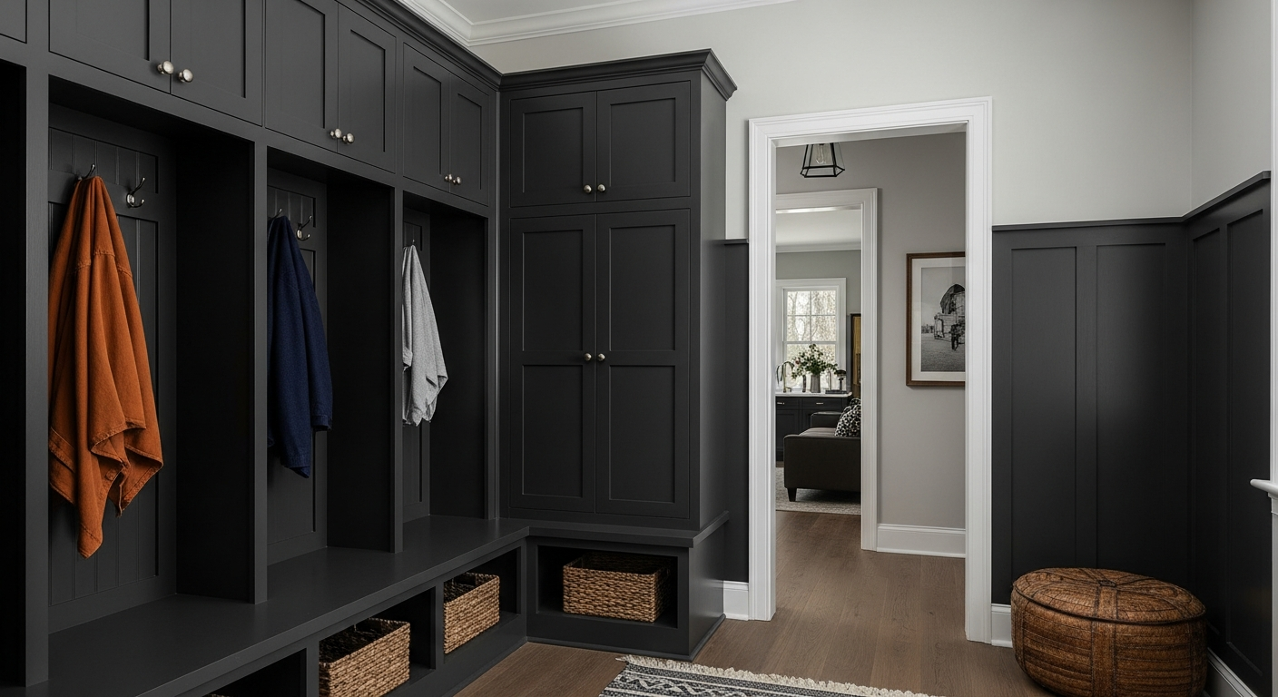
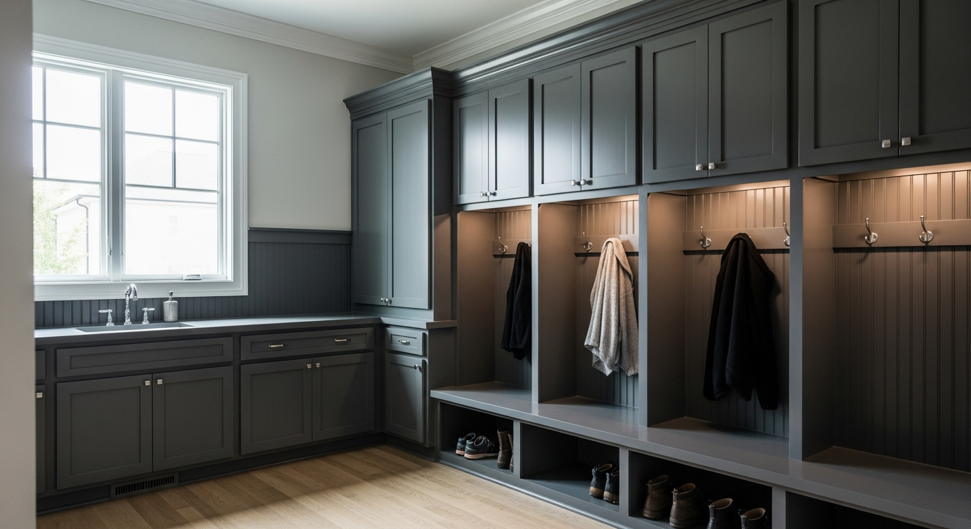
When applied floor-to-ceiling—wrapping the millwork, the cubbies, and the beadboard—Iron Ore commands respect. It transforms a chaotic drop-zone into a deliberate, monolithic statement. The eye is no longer drawn to the clutter of heavy coats and wet boots; instead, it is captivated by the structural rhythm of the cabinetry against a rich, deeply saturated canvas.
Light, Shadow, and the Behavior of Pigment
The magic of a deeply saturated pigment lies in its relationship with natural light. In Indianapolis, the angle and temperature of the sun shift violently with the seasons.
During the dead of January, when the sky above Marion County is a flat, unforgiving slate, the light entering a mudroom window is exceptionally cool. Under these conditions, Iron Ore hardens slightly, presenting a tailored, architectural charcoal that feels immensely protective. It builds a visual fortress against the cold.
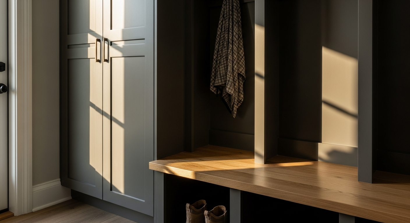
Conversely, when the low, golden light of an Indiana summer evening hits that same pigment, the color behaves entirely differently. The warmth of the sun pulls the subtle olive undertones to the surface. The paint softens, reacting to the light rather than fighting it. This dynamic interplay means the room is never static. The walls shift in mood and tone, dictated by the exact coordinates of the sun and the specific regional atmosphere pressing against the glass.
The Geometry of Contrast: Trim and Texture
A color with the immense weight of Iron Ore cannot exist in a vacuum. It requires highly calculated companions to establish scale and visual relief. The common mistake is to pair a deep charcoal with a surgical, unyielding white. That creates a stark, vibrating contrast that exhausts the eye and ruins the intended calm.
The correct architectural response is Sherwin-Williams Alabaster (SW 7008).
Used on the ceiling and the adjacent hallway trim, Alabaster possesses an LRV of 82 and a subtle, creamy warmth. It provides a luminous offset without introducing the jarring sterility of a pure titanium white. The transition from the dense, light-absorbing Iron Ore of the mudroom into the softly glowing Alabaster of the main house signals a distinct psychological shift. The visual tension releases. The heavy lifting is done.
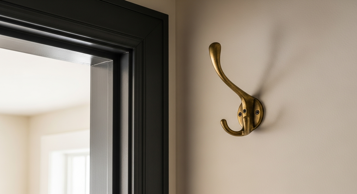
To complete this specific visual relationship, tactile elements must be introduced to break the dark mass. Natural white oak benches, left with an open grain and a matte finish, introduce organic warmth that speaks directly to the subtle brown undertones of the paint. Finally, unlacquered brass hardware—hooks, hinges, and pulls—serves as the jewelry of the space. Against the dark, matte void of Iron Ore, the glint of aged brass provides essential focal points, catching fragments of light and proving that utility and profound aesthetic beauty are never mutually exclusive.