


If you want a space to feel grounded, intentional, and endlessly sophisticated, you need to look at Sherwin Williams Urbane Bronze.
I consult on homes across the country, looking at how light acts in different climates and elevations. Clients frequently ask me for a color that feels dramatic but not overwhelming. They want warmth, but they fear the flat, dated look of a standard brown. Urbane Bronze bridges that exact gap. It is a brilliant, heavy anchor that completely transforms the physical perception of a room.
The Anatomy of a Perfect Dark Neutral
Urbane Bronze sits precisely on the fault line between warm charcoal, dark chocolate, and deep forest moss. It possesses a very low Light Reflectance Value. It absorbs the light hitting the walls rather than bouncing it back into your eyes. This physical trait creates immediate intimacy.

Work Directly with Torlando Hakes
Skip the color choice stress. Work directly with me as your personal Color Designer to select the perfect architectural palette for your home, and get a Complementary Color Consultation when you purchase paint through us.
The undertone is crucial here. If a dark brown lacks a green undertone, it shifts toward purple or maroon under incandescent light. That creates a bruised, heavy feeling. Urbane Bronze relies on a heavy dose of earthy green to keep the color grounded in nature.
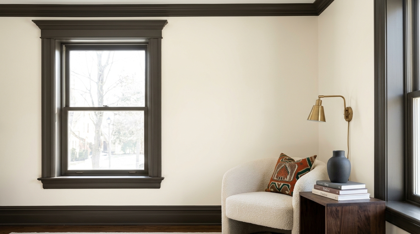
You apply this color to a wall, and the drywall instantly feels like it has weight. Apply it to the trim and you invert the gravity into a modern boho feel. It turns a standard-issue room into a deliberate, focused environment.
Managing Directional Light
Every paint color shifts throughout the day, but dark, complex neutrals undergo the most radical transformations. You have to watch the sun track across this color to truly understand it.
I always advise my design clients to paint large swatches on multiple walls before committing. In a room with northern exposure, the ambient light is cooler and more blue. Under these conditions, Urbane Bronze cools down slightly. The charcoal tones push forward, giving the room a sharper, more tailored appearance.
Put this same color in a west-facing room bathed in late afternoon sunlight, and the opposite happens. The warm, golden light pulls out the rich brown and bronze notes. The walls heat up visually. The color responds dynamically to its environment, making the room feel alive as the day progresses.

The Power of Color Drenching
A common mistake I see in high-end residential interiors is pairing a beautiful dark wall color with stark white baseboards and window casings. High-contrast white trim creates a harsh visual stutter. It aggressively outlines the room and stops the eye.
To maximize the impact of Urbane Bronze, you need to color drench the space. Paint the baseboards, the door casings, the crown molding, and even the ceiling in the exact same color. Vary the sheen if you want—matte for the walls, satin for the trim—but keep the hue continuous.
This approach creates an unbroken architectural plane. The corners of the room visually disappear. The space wraps around you, forcing the focus onto your furnishings, your art, and the views out your windows.

Anchoring with Organic Materials
Deep architectural colors require tactile, earthy companions. You cannot pair a grounded color like Urbane Bronze with cheap, glossy plastics or sterile, cool-toned synthetics. It demands authenticity.
Bring in oiled walnut furniture. Use unlacquered brass hardware that will develop a living patina over time. Introduce heavy, textured fabrics like heavy linen, wool bouclé, and vintage leather. Lay down a rug in warm sand or muted ochre tones.
The dark walls serve as the ultimate backdrop for natural materials. The heavy, matte finish of the paint allows the grain of the wood and the subtle veining of natural stone to take center stage.
Taking the leap into dark paint requires confidence. You have to commit to the depth and trust the architectural process. Paint is the easiest way to manipulate the physical feeling of a room. Find a space that needs gravity, roll on a coat of Urbane Bronze, and watch how beautifully the light settles into the shadows.
Featured Color Palette

Urbane Bronze (#54504A) — Featured Craftsman Painter color selection.
 After
After Before
Visualize Your Space with Color Studio AI
Planning a project? Skip the paint chip guesswork. Use our Color Studio AI to instantly visualize these paint colors on your own walls, or take advantage of our aligned contractor pricing matching current Sherwin-Williams retail promotions.
Book Your Upcoming Paint Project
Craftsman Painter is now scheduling premium transformations. Secure your spot and elevate your property value.
Get an EstimateHelp Others Find Professional Color Insights
Share this story directly to your networks or copy the link to share with friends.