


Atlanta is not just humid; it is a city built beneath a dense, suffocatingly beautiful urban forest. The light filtering through the heavy canopy of towering oaks and magnolias is heavily dappled, carrying an inherent green cast. This is not the sharp, unforgiving white light of the desert, nor the flat gray of the Pacific Northwest. Southern light is a living, breathing entity that bends, refracts, and demands absolute chromatic respect.
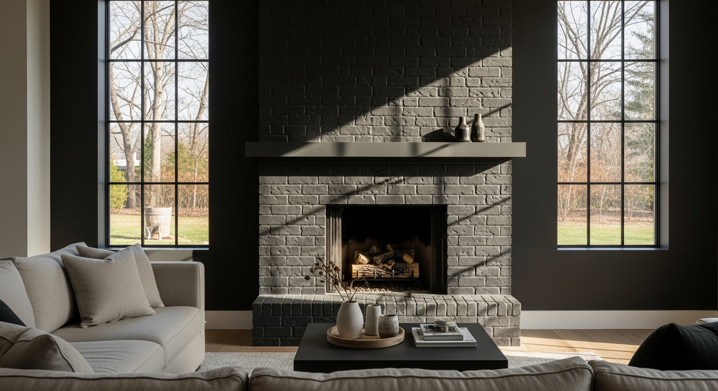
The Chromatic Gravity of the Anchor
Rooted in the foundational teachings of the Eskenazi School of Art, Architecture + Design, one principle remains absolute: color is never merely a surface treatment. It is a spatial boundary. To anchor a hearth under the aggressive, shifting light of a Georgia summer requires a color that absorbs excess glare while radiating complexity.
Enter Benjamin Moore’s Wrought Iron (2124-10).

Work Directly with Torlando Hakes
Skip the color choice stress. Work directly with me as your personal Color Designer to select the perfect architectural palette for your home, and get a Complementary Color Consultation when you purchase paint through us.
This is not black. Black is a void; black absorbs all energy and gives nothing back. Wrought Iron is a deeply atmospheric charcoal with an LRV (Light Reflectance Value) of exactly 6.16. It operates on a razor-thin edge between deep graphite, bruised navy, and wet slate. When applied to the central masonry or the surrounding millwork of a living room hearth, it creates an immediate visual black hole that somehow manages to feel warm. It grounds the room with intense architectural weight, forcing the eye to read the rest of the space as expansive and airy.
Manipulating the Canopy Light
The true brilliance of Wrought Iron reveals itself as the sun moves across the Atlanta sky. In the humid, diffused morning hours, eastern exposure pulls the subtle blue-gray undertones to the surface. The hearth appears cool, sophisticated, and quiet. It absorbs the harsh morning glare, providing a resting place for the eye.
By late afternoon, when the intense, golden southern sun begins blasting through the glass, the color shape-shifts. The green reflection off the outdoor foliage strikes the Wrought Iron, and the color’s hidden brown undertones ignite. The hearth suddenly reads as an earthy, grounded anchor. This chameleon-like light absorption is the hallmark of a masterfully engineered pigment. It does not fight the heavy, shifting woodland light of the South; it harnesses it.
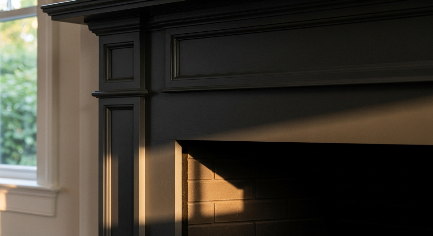
Strategic Complements and Trim Mathematics
A dark hearth cannot exist in a vacuum. The visual tension of the room relies entirely on the surrounding coordinates. Surrounding Wrought Iron with stark, hospital whites creates a jarring, aggressive contrast that instantly cheapens the architecture. The transition must be handled with deliberate subtlety.
The undisputed champion for flanking a Wrought Iron hearth is Benjamin Moore’s White Dove (OC-17). With an LRV of 85.38 and a whisper of a warm, greige undertone, White Dove acts as the perfect atmospheric bridge. It carries enough warmth to soften the transition from the charcoal anchor to the walls, preventing the room from feeling like a harsh geometric grid.
When the trim and adjacent walls are draped in White Dove, the Wrought Iron hearth stops being merely a painted surface. It becomes a monumental feature. The dark color recedes into the background, allowing the firebox, the architectural angles, and the curated objects resting on the mantel to step forward into the light.
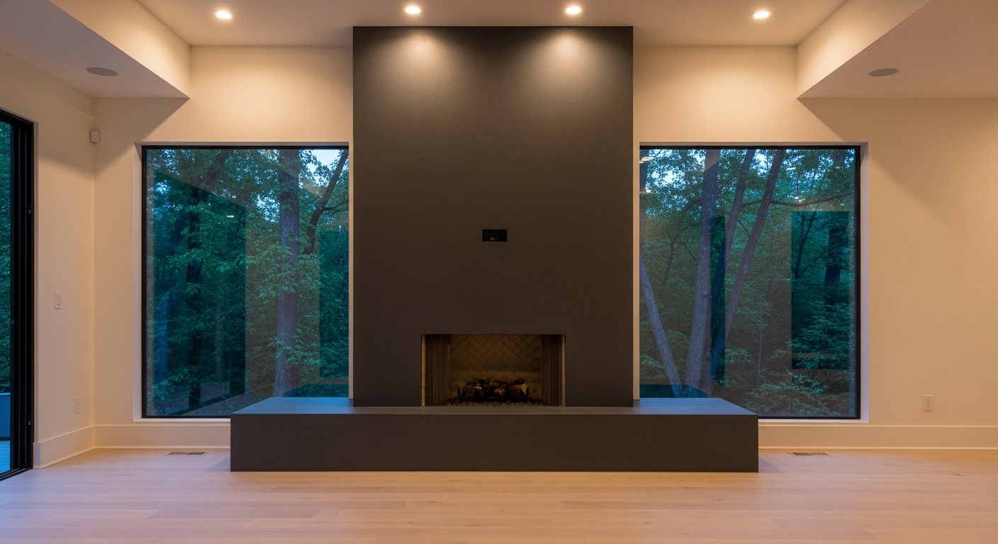
The Visceral Impact of the Finish
The relationship between light and pigment is ultimately dictated by sheen. Gloss reflects; matte absorbs. To honor the architectural integrity of a central hearth, high-gloss finishes must be banished. They create distracting hot spots that bounce the harsh midday Atlanta sun directly into the eyes of anyone sitting in the room.
Wrought Iron applied in a dead flat or low-sheen eggshell finish absorbs the light, turning the hearth into a velvet expanse. It softens the hard edges of brick, stone, or millwork, wrapping the room’s focal point in a quiet, rugged sophistication. The result is a living room that feels instinctively protective, endlessly complex, and flawlessly tethered to the natural world just beyond the glass.
 After
After Before
Visualize Your Space with Color Studio AI
Planning a project? Skip the paint chip guesswork. Use our Color Studio AI to instantly visualize these paint colors on your own walls, or take advantage of our aligned contractor pricing matching current Sherwin-Williams retail promotions.
Book Your Upcoming Paint Project
Craftsman Painter is now scheduling premium transformations. Secure your spot and elevate your property value.
Get an EstimateHelp Others Find Professional Color Insights
Share this story directly to your networks or copy the link to share with friends.