
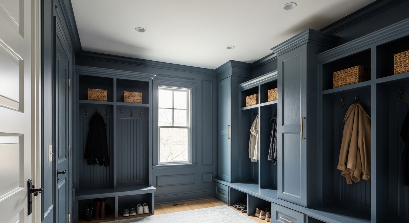

Enter Sherwin-Williams Pewter Green (SW 6208).
This isn't merely a paint choice; it is a structural intervention. When managing the high-impact utility gateway of a home—where heavy wool coats, salted boots, and the chaotic transition between the outside world and domestic sanctuary collide—the color palette must perform psychological heavy lifting. Pewter Green is an absolute masterclass in visual grounding, behaving less like a pigment and more like an architectural anchor.
The Psychology of the Transition Zone
A successful mudroom must communicate immediate warmth without resorting to superficial brightness. It is a space of shedding layers, both physical and mental. High-chroma colors or aggressive, stark whites induce anxiety in a space defined by clutter and utility. By contrast, a deeply saturated, desaturated hue commands the space, demanding that the eye focus on the depth of the walls rather than the inevitable chaos of winter gear.

Work Directly with Torlando Hakes
Skip the color choice stress. Work directly with me as your personal Color Designer to select the perfect architectural palette for your home, and get a Complementary Color Consultation when you purchase paint through us.
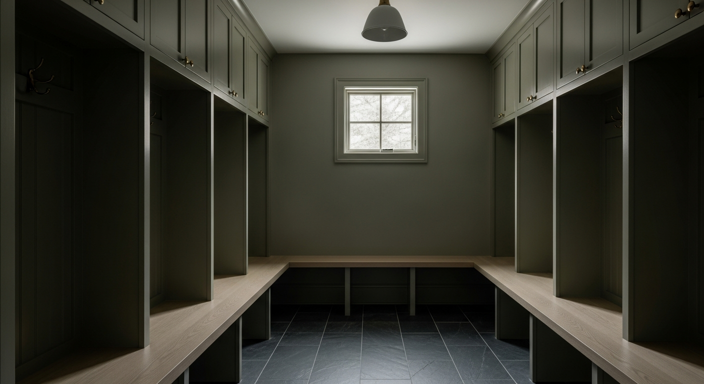
Pewter Green operates on a specific wavelength that naturally lowers the heart rate. It is an earthy, organic tone that bridges the gap between the frozen landscape outside and the warmth of the interior. Wrapping a transition space in this color establishes an immediate boundary. The home begins here, wrapped in a protective, chromatic shell.
Surviving the Lake Effect Light
Understanding paint in Cleveland requires a localized understanding of solar geometry and cloud cover. For six months of the year, natural light in this region is entirely diffused by a thick, monochromatic marine layer off the lake.
Pewter Green sits at a Light Reflectance Value (LRV) of 12. It does not attempt to fight the gloom; it absorbs it and transforms it into velvet. In a north-facing mudroom, where the natural light is universally cool and blue-tinted, this color’s silver undertones step aggressively forward. The green cools down, presenting as an aged, structural metal. It feels historic, stoic, and immensely sophisticated.
Conversely, if the space features southern exposure, the harsh, blinding glare bouncing off a January snowpack alters the pigment entirely. The intense reflected light warms the paint, pulling the deep, muddy olive notes to the surface. It is a chameleon, responding to the specific atmospheric conditions of the Midwest with a rugged grace that flat, primary colors simply cannot achieve.
Erasing Boundaries with Color Drenching
Utility spaces are notoriously cramped. The amateur instinct is to paint them white to "open them up." This is a fundamental misunderstanding of color theory. White paint in a small, poorly lit space does not create volume; it creates a dingy, shadowed box that highlights every scuff and smudge.
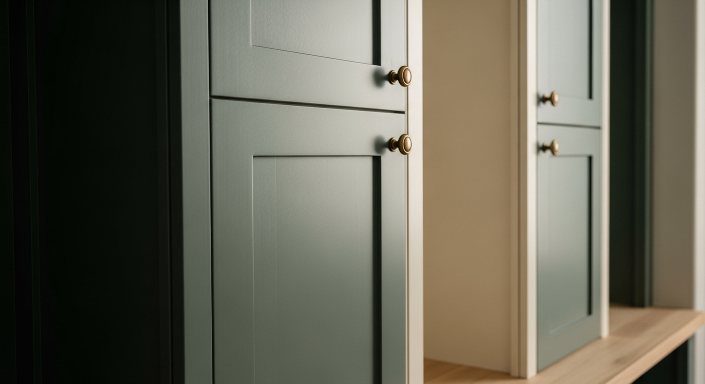
The professional execution involves color drenching—taking Pewter Green across the baseboards, up the beadboard, over the crown molding, and straight across the ceiling. By eliminating the high-contrast trim lines, the physical boundaries of the room vanish into shadow. The corners recede. The ceiling floats. The space ceases to feel like a confined closet and instead becomes an infinite, jewel-box vestibule. The architectural weight of the color absorbs the hard angles of the room, creating an illusion of vast, moody space.
Exact Coordinates and Environmental Harmony
A color this complex cannot exist in a vacuum. The visual relationships established by coordinating tones make or break the installation. Pairing Pewter Green with a blinding, off-the-shelf ceiling white is a violently jarring mistake. The contrast is too sharp, instantly cheapening the aesthetic and destroying the atmospheric tension.
The visual relationship demands a mediator with just enough warmth to offset the silver undertones of the green. Sherwin-Williams Shoji White (SW 7042), with its LRV of 74, is the precise coordinate required for adjacent hallways or any necessary ceiling breaks. It is a warm, complex greige-white that leans slightly creamy without ever reading yellow. It provides a soft, elegant handoff from the heavy mudroom into the main living areas.
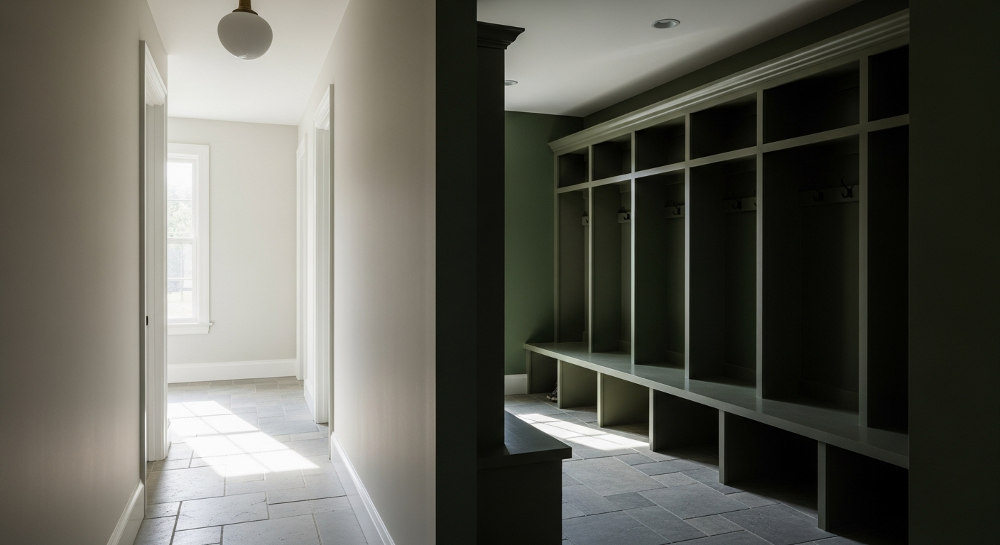
Complete the environment with highly tactile, matte finishes. High-gloss reflects too much light and shatters the moody illusion. A flat or matte finish on the walls, paired with an eggshell on the millwork, allows the lighting to pool softly across the surfaces. Ground the space with heavily textured, organic materials—a honed cleft slate floor in deep charcoal and a bench of raw, rift-sawn white oak.
The resulting space doesn't just manage the brutal realities of a Cleveland winter. It elevates the act of coming home into a masterclass of visual harmony.
 After
After Before
Visualize Your Space with Color Studio AI
Planning a project? Skip the paint chip guesswork. Use our Color Studio AI to instantly visualize these paint colors on your own walls, or take advantage of our aligned contractor pricing matching current Sherwin-Williams retail promotions.
Book Your Upcoming Paint Project
Craftsman Painter is now scheduling premium transformations. Secure your spot and elevate your property value.
Get an EstimateHelp Others Find Professional Color Insights
Share this story directly to your networks or copy the link to share with friends.