
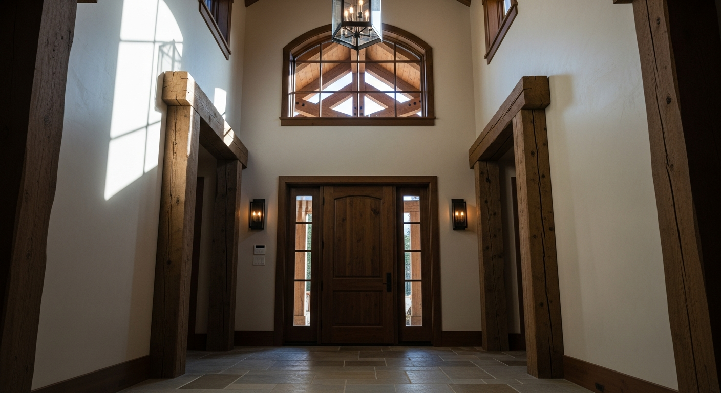

At 7,000 feet above sea level, the atmosphere is thin. The high-altitude sunlight is notoriously harsh, slicing through the canopy of ponderosa pines with a high-ultraviolet intensity that washes out weak pastels and turns standard builder-grade grays into institutional concrete. Designing for this specific regional climate requires a color with enough chromatic gravity to stand up to the mountain sun without screaming for attention.
Enter Benjamin Moore’s Crown Point Sand (HC-16).
This is not a color for the timid. It is a masterful, historically rooted shade that designers quietly stockpile for spaces demanding grounded sophistication. To understand why this specific pigment formulation transforms a Flagstaff threshold, one must dissect its underlying visual relationships and structural color theory.

Work Directly with Torlando Hakes
Skip the color choice stress. Work directly with me as your personal Color Designer to select the perfect architectural palette for your home, and get a Complementary Color Consultation when you purchase paint through us.
Deconstructing a Muddy Masterpiece
Amateur observers might look at a swatch of Crown Point Sand and lazily categorize it as beige. That is a fundamental misreading of the color coordinates. Crown Point Sand is a complex, muddy mustard-khaki. It operates with a Light Reflectance Value (LRV) of 41.5, placing it squarely in the mid-tone range. It is dark enough to absorb the shocking brightness of a Flagstaff winter morning, yet luminous enough to prevent a narrow entryway from feeling like a subterranean cavern.
The magic lies in the undertones. HC-16 is built on a yellow-ochre base, but it is aggressively dragged down by profound green and gray pigments. This muddiness is precisely what makes it luxurious. Pure colors lack nuance; they flatten a room. A color burdened by complex gray and green undertones reacts dynamically to shifting light.
When a door is flung open to a Flagstaff autumn, the green-gray resonance of Crown Point Sand reaches out and harmonizes directly with the needles of the surrounding ponderosa pines. It creates a seamless visual dialogue between the rugged exterior topography and the refined interior architecture.
The Physics of High-Desert Light
Color does not exist in a vacuum. It is entirely dependent on the specific wavelength of light hitting it. In Northern Arizona, the trajectory and temperature of natural light shift violently throughout the day.
An eastern-facing entryway catches the early morning light. At this elevation, morning light is sharp, cool, and heavily skewed toward the blue end of the spectrum. Under this exposure, the golden-yellow base of Crown Point Sand acts as a thermal counterbalance. It warms the frost of the blue light, rendering the threshold inviting rather than clinical.
Conversely, consider the brutal, raking exposure of a western-facing door at golden hour. The afternoon sun in Flagstaff is a piercing, saturated amber. If a wall is painted a pure yellow or a warm cream, this intense western light will set the room on fire, turning the walls an offensive, toxic neon. Because Crown Point Sand is heavily anchored in gray and green, those muddy undertones absorb the amber shock. The color holds its ground, deepening into a rich, burnished bronze rather than losing its structural integrity.
Orchestrating the Visual Anchors
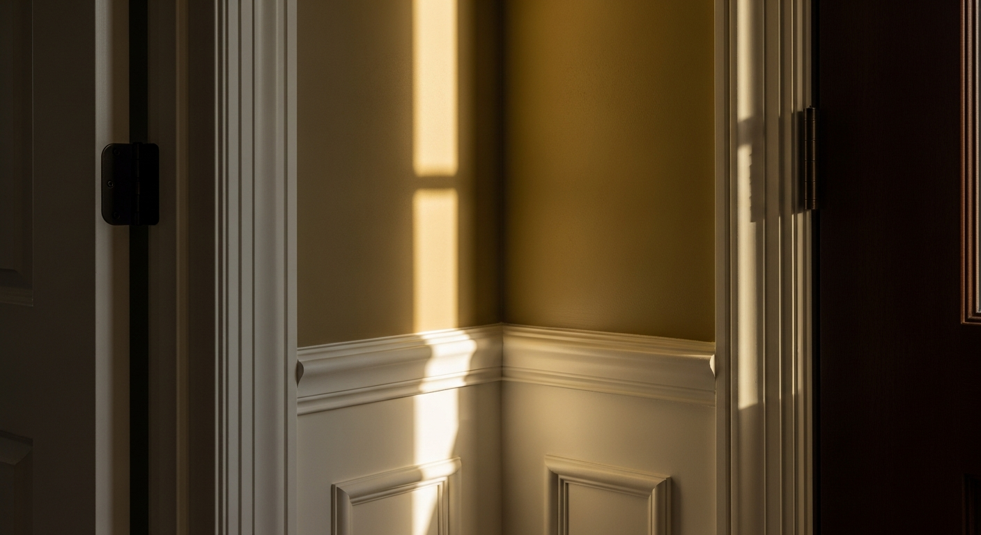
A heavy, atmospheric wall color demands precise coordination. Slapping a brilliant, un-tinted titanium white on the trim next to HC-16 is an architectural crime. The stark contrast shatters the organic illusion, making the woodwork look like cheap plastic against the earthy walls.
To execute this entryway flawlessly, the visual relationships must remain harmonious. Benjamin Moore’s White Dove (OC-17) is the definitive coordinating trim. White Dove contains microscopic drops of yellow and gray, making it a shaded, creamy off-white. When placed against the mustard-khaki weight of Crown Point Sand, White Dove provides crisp architectural definition without introducing a jarring, artificial temperature shift.
To ground the space entirely, consider the transition points. Matte, oil-rubbed bronze hardware on the doors and natural cleft slate flooring complete the visual trinity. The dark bronze hardware anchors the lightness of the trim, while the cool, charcoal undertones of the slate floor push the warmth of the Crown Point Sand upward into the line of sight.
The entryway is the handshake of a home. In a landscape as dominating as the San Francisco Peaks, that handshake needs to be firm, warm, and deeply rooted in its environment. By manipulating light absorption and leveraging complex undertones, Crown Point Sand doesn’t just color a wall. It establishes a profound sense of place.
 After
After Before
Visualize Your Space with Color Studio AI
Planning a project? Skip the paint chip guesswork. Use our Color Studio AI to instantly visualize these paint colors on your own walls, or take advantage of our aligned contractor pricing matching current Sherwin-Williams retail promotions.
Book Your Upcoming Paint Project
Craftsman Painter is now scheduling premium transformations. Secure your spot and elevate your property value.
Get an EstimateHelp Others Find Professional Color Insights
Share this story directly to your networks or copy the link to share with friends.