
Enter Sherwin-Williams Lady’s Slipper (SW 7139). Banish any immediate thoughts of saccharine nurseries or mid-century kitsch. This is a sophisticated, deeply grounded, muddy blush. It is a color that holds immense architectural weight, fundamentally altering the visual relationship between plaster, glass, and the heavy Midwest sky.
The Architecture of Blush Under a Lake Effect Sky
Color does not exist in a vacuum; it is entirely at the mercy of its geographic environment. In the flat, diffuse northern light of an Ohio winter afternoon, a standard warm tone will often read as dirty, while a cool tone will turn sterile. Lady’s Slipper operates on a different frequency.
Boasting a carefully calibrated Light Reflectance Value (LRV), SW 7139 possesses the exact density required to absorb the harshness of Cleveland's daylight without losing its identity. As the gray light hits the dining room walls, the subtle, dusty-brown undertones of Lady's Slipper emerge to the forefront. It acts as an atmospheric buffer. The color grounds the spatial volume of the room, turning what could be a frigid, cavernous space into something distinctly tactile. It does not fight the gray; it collaborates with it, creating a visual harmony that feels rooted and intentional rather than desperate for sunshine.
Book Your Upcoming Paint Project
Craftsman Painter is now scheduling premium transformations. Secure your spot and elevate your property value.
Get an EstimateCoordinating the Narrative: Trim and Contrast
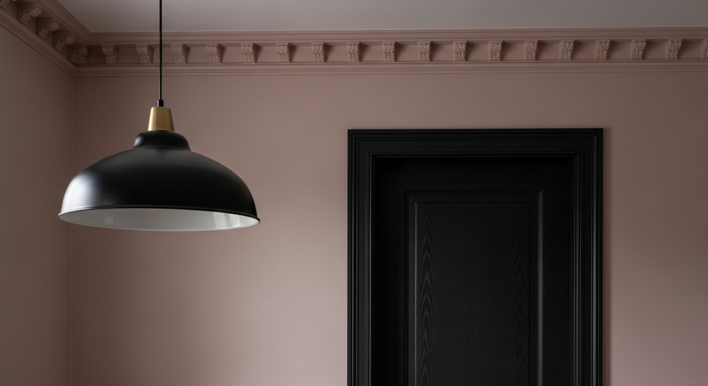
A wall color of this magnitude demands absolute precision in its coordinates. Framing Lady's Slipper with a stark, unyielding white trim is a fatal error that fractures the room's warmth and immediately cheapens the aesthetic. The visual transition between the wall and the millwork must be seamless.
Sherwin-Williams Alabaster (SW 7008) is the mandatory companion here. Alabaster provides a creamy, understated edge that respects the blush tone without competing for dominance. It allows the dining space to breathe. To anchor the room and prevent the blush from floating into the ethereal, aggressive contrast is necessary. Introducing Sherwin-Williams Iron Ore (SW 7069) on interior French doors, window sashes, or a heavy baseboard creates a grounding, masculine tension. The juxtaposition of the soft, fleshy blush against the brutalist charcoal forces the eye to recognize the deliberate, high-end curation of the space.
The Nocturnal Metamorphosis
Dining rooms are inherently nocturnal creatures. The true test of a dining room’s palette is how it performs when the lake effect snow swirls outside and the evening ambient light takes over. This is where Lady’s Slipper transcends standard color theory and enters the realm of psychological manipulation.
Under the influence of incandescent bulbs or 2700K LEDs, the gray undertones of SW 7139 recede into the plaster. The color undergoes a chemical change, enveloping the room in a radiant, terracotta-adjacent warmth. This is the phenomenon of light absorption at its absolute peak. The walls effectively bounce a universally flattering, golden-pink glow across the dining table. It makes roasted root vegetables and heavy winter stews look richer. It softens the harsh shadows on the faces of dinner guests, making them look vital, engaged, and alive.
Choosing this precise shade is a defiance of the rust belt freeze. It is a sophisticated, calculated embrace of color interplay that transforms the simple act of breaking bread into a visually intoxicating experience.