
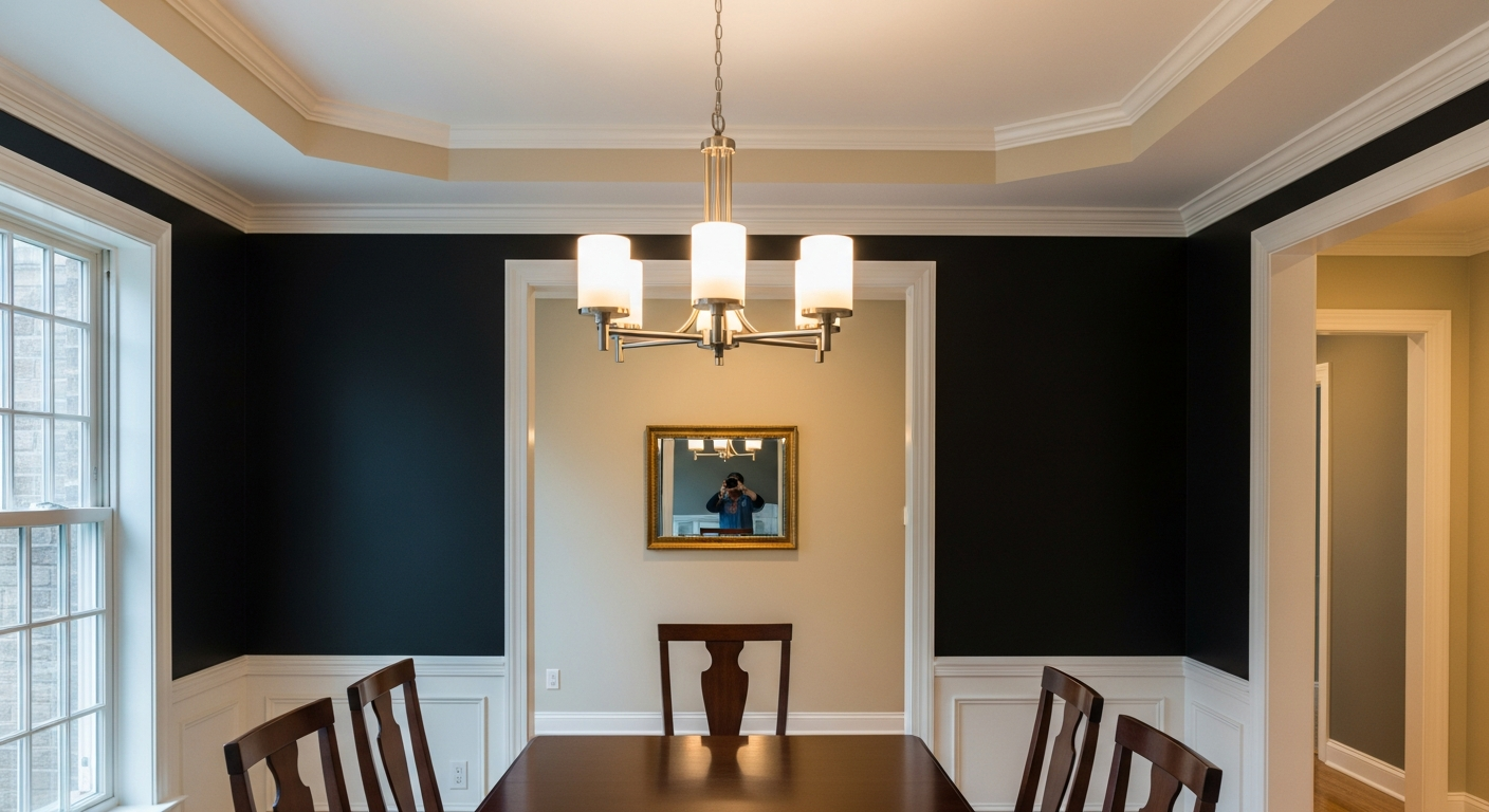

Caviar is not merely a dark paint; it is an exercise in atmospheric manipulation. It is the color of a void, but a remarkably warm one. Where standard industrial blacks flash blue or purple under the icy bite of Ohio’s winter light, Caviar holds its ground. It swallows the gloom and redefines the boundaries of the room, forcing the eye inward toward the table, the food, and the people.
The Architecture of Light Absorption
Understanding how color functions in a dining space means respecting the physics of light. Caviar boasts a Light Reflectance Value (LRV) of exactly 3. On a scale of zero to one hundred, where zero is absolute darkness, an LRV of 3 means the wall is actively absorbing 97 percent of the light that hits it.
In a hyper-local climate where the winter sun sits low and lazy on the horizon, bouncing weak, ambient light through naked oak trees, high-reflectance walls scatter that dismal energy around the room. Caviar stops the scattering dead in its tracks. By absorbing the weak daytime light, the walls visually recede. The physical boundaries of the dining room blur, creating an illusion of infinite, velvety space rather than a confined box painted in a dark hue.

Work Directly with Torlando Hakes
Skip the color choice stress. Work directly with me as your personal Color Designer to select the perfect architectural palette for your home, and get a Complementary Color Consultation when you purchase paint through us.
When the lake effect snow squalls roll in and the ambient light drops entirely, the color transitions from a structural anchor to a protective cocoon. The psychological comfort is visceral. It mimics the safety of a heavy wool blanket, insulating the interior narrative from the bitter reality outside the glass.
Undertones and the Evening Shift
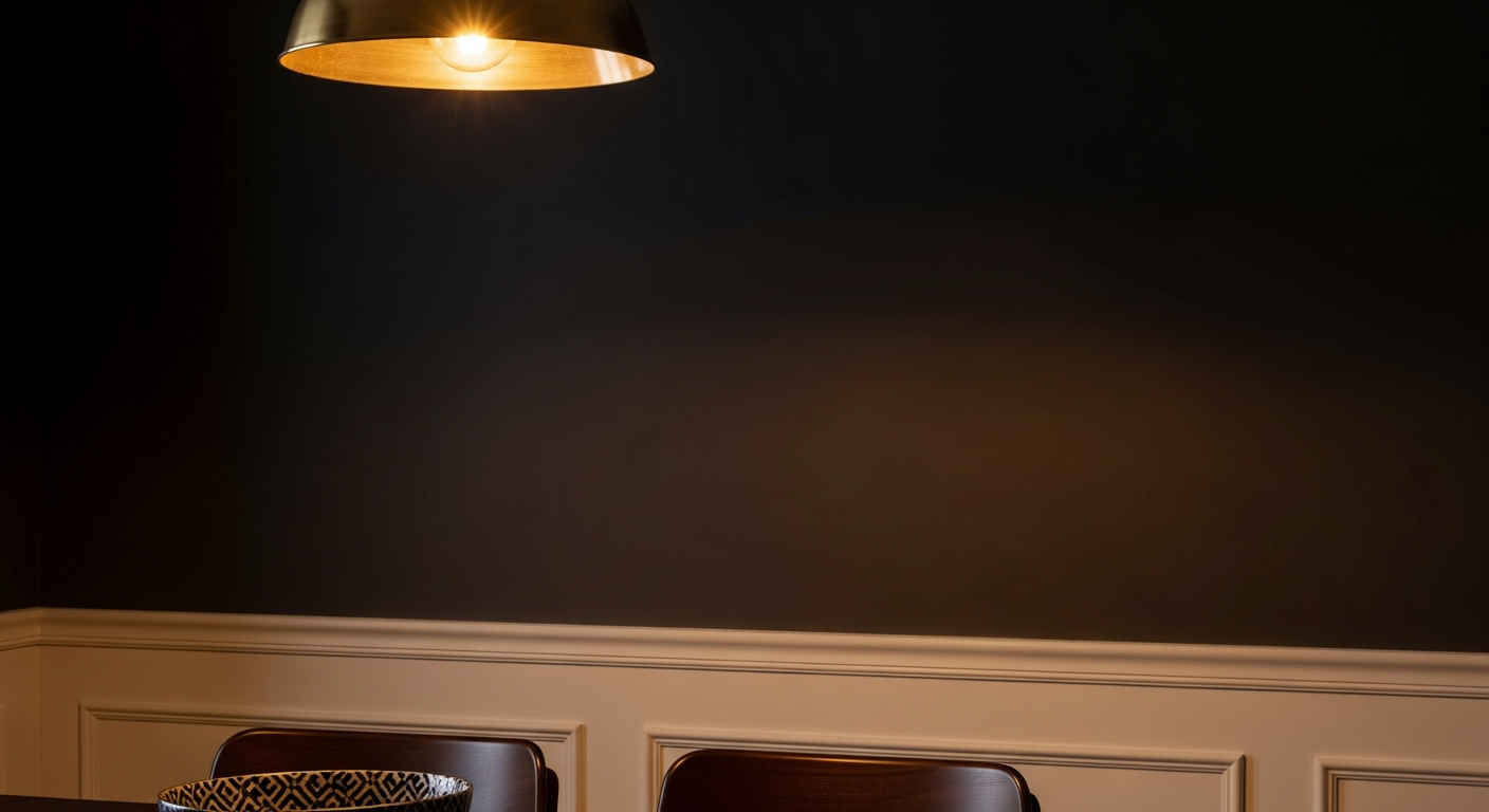
The true genius of Caviar reveals itself after sundown. The dining room is primarily an evening space, meant to be experienced under the alchemical glow of incandescent bulbs, tapered beeswax candles, and the amber light of a low-hanging pendant.
Caviar possesses an almost imperceptible umber undertone. It is a black born from the earth, not from a synthetic laboratory. When exposed to 2700 Kelvin lighting—the gold standard temperature for dining room fixtures—that subtle brown undertone activates. The walls lose their absolute darkness and begin to glow with a deep, sepia-toned richness.
This visual relationship dictates the mood of the meal. The walls recede into a soft, cinematic background out of focus. Skin tones become radiant against the dark backdrop. The colors of a roasted root vegetable dish or a ruby-toned wine are suddenly amplified, popping off the table with gallery-level intensity because the surrounding visual noise has been entirely muted.
Orchestrating the Trim and Ceiling Coordinates
A dark wall demands rigorous framing. Applying Caviar to a dining room without calculating the exact coordinates of the adjacent trim and ceiling is a failure of basic color theory. Stark, un-tinted white trim will instantly ruin the illusion, creating a jarring, high-contrast tuxedo effect that feels cheap and aggressively modern.
To ground Caviar in a sophisticated, traditional Cleveland colonial or a revitalized shaker-style bungalow, the trim requires a coordinating warmth. Sherwin-Williams Alabaster (SW 7008) is the absolute correct answer here. With an LRV of 82, Alabaster is bright enough to provide architectural definition but carries a creamy, greige undertone that respectfully shakes hands with Caviar’s warmth. Painted in a satin finish on baseboards and crown molding, Alabaster acts as a soft boundary line that doesn't scream for attention.
The ceiling presents another critical visual relationship. Leaving a dining room ceiling flat, dead white above a Caviar wall is like leaving the top of a canvas unpainted. To execute the design properly, lower the visual ceiling height by wrapping it in Sherwin-Williams Accessible Beige (SW 7036). This creates an enveloping, tonal canopy that reflects the ambient light of the chandelier downward, ensuring the diners are bathed in a flattering, warm radiance while the surrounding walls disappear into the night.
Choosing Caviar is not about following a moody design trend. It is an intentional, calculated response to the specific quality of Northern light. It is an understanding that in a city where the sky so often feels heavy and gray, the most radical way to bring warmth into a home is to embrace the dark.
 After
After Before
Visualize Your Space with Color Studio AI
Planning a project? Skip the paint chip guesswork. Use our Color Studio AI to instantly visualize these paint colors on your own walls, or take advantage of our aligned contractor pricing matching current Sherwin-Williams retail promotions.
Book Your Upcoming Paint Project
Craftsman Painter is now scheduling premium transformations. Secure your spot and elevate your property value.
Get an EstimateHelp Others Find Professional Color Insights
Share this story directly to your networks or copy the link to share with friends.