Latest Dispatches
Tricorn Black: A Sophisticated Shade for the Modern Home
Today, we delve into the enigmatic depths of Sherwin-Williams’ Tricorn Black, a paint color that takes its rightful claim as a sophisticated design element, making fine furniture blush next to it.

“Super Paint vs Cashmere: Choosing the Right Paint for Your Space”
[SuperPaint Vs. Cashmere. #Marooned #InteriorPaintingTips #ColorDesignExpert #PaintingTutorial
Shadows and Light: Full Home Palette with Sherwin Williams Colors
In the world of interior design, the power of color cannot be understated. It’s the silent language that speaks volumes, transforming spaces into experiences. Today, we delve into a color scheme that defies the ordinary, embracing the depth of darker hues while finding equilibrium with softer, neutral tones. Sherwin Williams, a name synonymous with quality and sophistication in paints, brings us a palette that is both thought-provoking and harmoniously balanced. We explore the interplay of Mount Etna, Dark Auburn, Relic Bronze, and Gossamer Veil.
The Depth of Indigo: Sherwin Williams’ Color Comparison
Indigo, a color that sits between blue and violet on the color wheel, is not only a visual delight but also a color that carries historical and cultural significance. It’s a color that represents depth, wisdom, and tranquility. Sherwin Williams offers two distinct shades of indigo — Indigo (SW 6531) and Indigo Batik (SW 7602) — each bringing a unique mood and style to interiors. In this article, we’ll dive into the nuances of these two shades, their applications, and how they can transform spaces.

Stay Cozy This Winter: Cost-Free Tips for Homeowners
Photo by Nachelle Nocom on Unsplash

Smokey Azurite SW 7615: The Blue That’ll Stop Your Scroll Dead in Its Tracks
The color blue, often associated with calmness and serenity, has been a perennial favorite in home design. Over time, its various shades, from the palest sky to the deepest navy, have been celebrated for their versatility and ability to evoke emotion. Recent design trends have especially embraced blue, utilizing it in ways that bring both boldness and subtlety to modern interiors.

Breathless by Sherwin Williams: Redefining Subtlety in Color
In the realm of interior design, colors hold the power to shape environments, crafting ambiances that resonate deeply with our sensibilities. Let’s explore a hue that redefines subtlety and sophistication: Breathless by Sherwin Williams.

Downing Slate by Sherwin Williams: A Palette of Subtle Depth
In the nuanced spectrum of interior design, Downing Slate by Sherwin Williams emerges as a hue that whispers its presence. Like the gentle encroachment of dusk, this color brings with it a depth that is felt, not just seen — a testament to its layered personality.
Embracing the Mist: The Versatile Charm of Evergreen Fog
Deemed the color of the year 2022 by Sherwin Williams, Evergreen Fog symbolizes a sense of rebirth and new beginnings. Like the early morning fog rolling through a dense evergreen forest, this color brings a touch of nature’s tranquility and mystery indoors.

Ascending Your Interior Game with Upward SW 6239 — Sherwin-Williams’ 2024 Color of the Year
If there’s one thing that’s constant in the world of design, it’s change. But there are some years when the change feels particularly electric, rife with the promise of new beginnings. Enter Upward SW 6239, Sherwin-Williams’ Color of the Year for 2024. Here at Craftsman Painter, we’re diving deep into this provocative hue to show you why it’s a color worthy of its lofty title and how it could enliven your living spaces.

The Elegance of White Raisin: A Guide to Enhancing Interior Spaces
Every shade carries with it an emotional undertone. With its muted and creamy elegance, White Raisin offers a serene sanctuary from the outside world. Picture an intimate reading nook or a quiet corner of a living room, where this shade creates a cozy and inviting atmosphere, beckoning one to relax and reflect.

I really enjoyed the production.
I really enjoyed the production. Much like everything else with Apple, I think other pre-produced keynotes haven’t compared. It’s an aspirational bar for sure BUT (and this is a big but) the energy of a live audience can’t be replaced by cinema 4D graphics.
The Artistic Fusion of Sherwin Williams’ Gossamer Veil and Griffin: A Palette that Speaks Volumes
Sherwin Williams is no stranger to the alchemy of color, and two of their hues — Gossamer Veil and Griffin — prove the magic that can happen when pigment meets ingenuity. In a world saturated with choices, picking the right colors for your space can feel overwhelming. That’s where the mastery of these two shades comes in, acting as the perfect conduits for a space that feels both inviting and sophisticated.

Moscow Midnight: An Ode to Elegance, Intrigue, and Culture
Deep, elegant, and brimming with mysterious allure, Sherwin Williams’ Moscow Midnight is a color that transcends mere aesthetics. This rich navy hue echoes the silent resonance of a midnight in Moscow, a place where history and modernity collide in a dance of culture, intellect, and art.

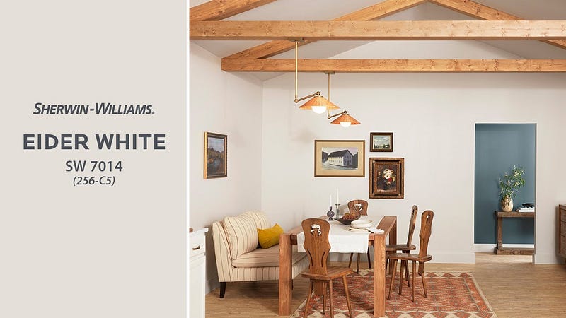
Eider White by Sherwin Williams: Redefining Elegance in Everyday Spaces
Eider White is a name that doesn’t shout; it whispers. In the ever-expanding spectrum of colors, this unique shade by Sherwin Williams strikes a chord that’s distinctly its own. Let’s explore the understated beauty of Eider White and how it’s redefining elegance in our everyday spaces.